Add a meter Image
ကၽြန္ေတာ္တုိ႕ အေနနဲ႕ <meter> tag ကို လက္ရိွ range value ကို ေဖာ္ျပတဲ့ ေနရာမွာ အသံုးျပဳႏိုင္ပါတယ္။
<meter>54 points</meter>ဆုိရင္ လက္ရိွ value မပါရိွတဲ့ အတြက္ ေအာက္ကလို သာ ေဖာ္ျပပါလိမ့္မယ္။

Figure 5-18
<meter value="38" min="0" max="100">38 points</meter>value က 38 ျဖစ္ျပီး အနိမ့္ဆံုးက 0 ။ အျမင့္ဆံုးက ၁၀၀ ျဖစ္တယ္လုိ႕ ဆုိထားပါတယ္။

Figure 5-19
အဲဒီ code ကို low , high , optimum attribute ေတြ ထည့္သြင္းပါမယ္။ အနိမ့္ ၊ အျမင့္ ႏွင့္ အျမင့္ဆံုးေပ့ါ။ အနီ ၊ အဝါ ႏွင့္ အစိမ္းေရာင္ေတြ နဲ႕ ေဖာ္ျပပါလိမ့္မယ္။

Figure 5-20
Loading အေနနဲ႕ ျပခ်င္တာ ။ progress အေနနဲ႕ အလုပ္လုပ္ေစခ်င္ရင္ေတာ့ meter အစား progress tag ကို သံုးသင့္ပါတယ္။
$0 <progress value="850" max="1000">$850</progress> $1000အဲဒီ code က chrome မွာ ဆုိရင္ ေအာက္ကလို ျမင္ရပါမယ္။
Figure 5-21
meter ကို လက္ေတြ႕ အသံုးခ်ထားတဲ့ code ကို ေလ့လာၾကည့္ရ ေအာင္
<html>
<head>
    <title>Meter</title>
    <style>
    @import url(http://fonts.googleapis.com/css?family=Roboto);

body {

  font-family: "Roboto", "Lucida Grande", "Lucida", sans-serif;
  margin: 5em auto;
  background: radial-gradient(#f9f9f9 20%, #ddd 80%);
  width: 550px;
}

h1 {

  font-size: 1.5em;
  margin: 0 auto 2.5em;
  font-weight: 700;
}

xmp {

  font-family: Consolas, Monaco, monospace;
  font-size: 85%;
  color: #666;
  font-weight: 400;
}

meter {

  display: block;
  margin: 0 auto;

  width: 550px;
  height: 25px;

  -webkit-appearance: none;
     -moz-appearance: none;
          appearance: none;

  border: 1px solid #ccc;
  border-radius: 3px;

  /* Firefox */
  background: none; /* Required to get rid of the default background prop. */
  background-color: whiteSmoke;
  box-shadow: 0 5px 5px -5px #333 inset;
}

meter::-webkit-meter-bar {

  background: none; /* Important to get rid of default background. */
  background-color: whiteSmoke;

  box-shadow: 0 5px 5px -5px #333 inset;
}

meter::-webkit-meter-optimum-value {

  transition: width .5s;
  box-shadow: 0 5px 5px -5px #999 inset;

  background-image: linear-gradient( 90deg,
                                     #8bcf69 5%,
                                     #e6d450 5%,
                                     #e6d450 15%,
                                     #f28f68 15%,
                                     #f28f68 55%,
                                     #cf82bf 55%,
                                     #cf82bf 95%,
                                     #719fd1 95%,
                                     #719fd1 100%);

  background-size: 100% 100%;
}

meter::-webkit-meter-optimum-value:hover {

  background-image: linear-gradient( 90deg,
                                     #8bcf69 20%,
                                     #e6d450 20%,
                                     #e6d450 40%,
                                     #f28f68 40%,
                                     #f28f68 60%,
                                     #cf82bf 60%,
                                     #cf82bf 80%,
                                     #719fd1 80%,
                                     #719fd1 100%);

  transition: width .5s;
  width: 100% !important; /* !important keyword used to override the inline style in ebkit browsers. */
}

meter::-moz-meter-bar {

  box-shadow: 0 5px 5px -5px #999 inset;

  background-image: linear-gradient( 90deg,
                                     #8bcf69 5%,
                                     #e6d450 5%,
                                     #e6d450 15%,
                                     #f28f68 15%,
                                     #f28f68 55%,
                                     #cf82bf 55%,
                                     #cf82bf 95%,
                                     #719fd1 95%,
                                     #719fd1 100%);

  background-size: 100% 100%;
}

p {

  margin: 0 auto ;
  width: 550px;
  line-height: 2.5;
}

.free-space {

  float: right;
}

.swatch {

  margin: 0; padding:0;
  margin: 5em auto;
  list-style-type: none;
  width: 550px;
  display: block;
  position: relative;
}

.swatch::before {

  content: '';
  width: 100%;
  height: 10px;
  outline: 0px solid #000;
  position: absolute;
  top: -20px;
  left: 0;
  border-radius: 2px;

  background-image: linear-gradient( 90deg,
                                     #8bcf69 20%,
                                     #e6d450 20%,
                                     #e6d450 40%,
                                     #f28f68 40%,
                                     #f28f68 60%,
                                     #cf82bf 60%,
                                     #cf82bf 80%,
                                     #719fd1 80%,
                                     #719fd1 100%);

}

.swatch__elem {

  outline: 0px solid #c00;
  float: left;
  width: 110px;
  padding-left: 5px;

  -webkit-box-sizing: border-box;
     -moz-box-sizing: border-box;
          box-sizing: border-box;
}

.used-space {

  display: block;
  line-height: 2;
  font-size: 85%;
  color: #666;
}

.meter-gauge {

    border: 1px solid #ccc;
    border-radius: 3px;

    background-color: whiteSmoke;
    box-shadow: 0 5px 5px -5px #333 inset;

    width: 550px;
    height: 25px;

    display: block;
}

.meter-gauge > span {

  height: inherit;
  box-shadow: 0 5px 5px -5px #999 inset;

  background-color: blue;
  background-image: linear-gradient( 90deg,
                                     #8bcf69 5%,
                                     #e6d450 5%,
                                     #e6d450 15%,
                                     #f28f68 15%,
                                     #f28f68 55%,
                                     #cf82bf 55%,
                                     #cf82bf 95%,
                                     #719fd1 95%,
                                     #719fd1 100%);

  background-size: 100% 100%;

  display: block;
  text-indent: -9999px;
}
</style>
</head>
<body>
    <h1>OSX-style Disk Usage <xmp>..using html5 <meter></xmp></h1>

<p>
  Macintosh HD <span class="free-space">64.54 GB free out of 120.47 GB</span></p>

<meter value="55.93" min="0" max="120.47" title="GB">
  <div class="meter-gauge">
    <span style="width: 46.42%;">Disk Usage - 55.93GB out of 120GB</span>
  </div>
</meter>

<ul class="swatch">
  <li class="swatch__elem">Audio <span class="used-space">670.5 MB</span></li>
  <li class="swatch__elem">Movies <span class="used-space">10.1 GB</span></li>
  <li class="swatch__elem">Photos <span class="used-space">25.19 GB</span></li>
  <li class="swatch__elem">Apps <span class="used-space">19.31 GB</span></li>
  <li class="swatch__elem">Other <span class="used-space">660.5 MB</span></li>
</ul>

</body>
</html>
အထက္ပါ code က browser မွာ ဆုိရင္ ေအာက္ကလုိ ျမင္ရပါမယ္။
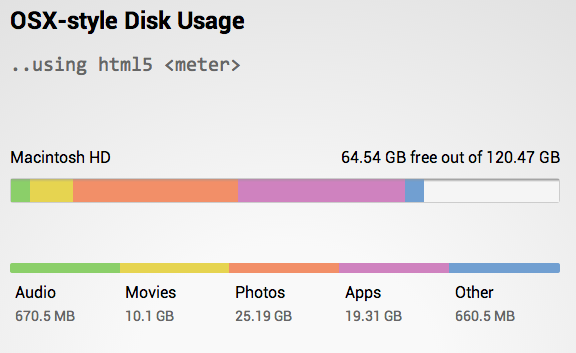
Figure 5-22
background image ကို linear-gradient အသံုးျပဳျပီး meter နဲ႕ ေဖာ္ျပထားတဲ့ example ေကာင္း တစ္ခုပါ။
အခု ဆုိရင္ေတာ့ image နဲ႕ ပတ္သက္ျပီး သိသင့္သိထိုက္သေလာက္ သိသြားပါျပီ။ ေနာက္တစ္ခန္းမွာ ကၽြန္ေတာ္တုိ႕ေတြ links ေတြ ခ်ိတ္ဆက္တဲ့ အေၾကာင္းကို ေလ့လာၾကည့္ရေအာင္။